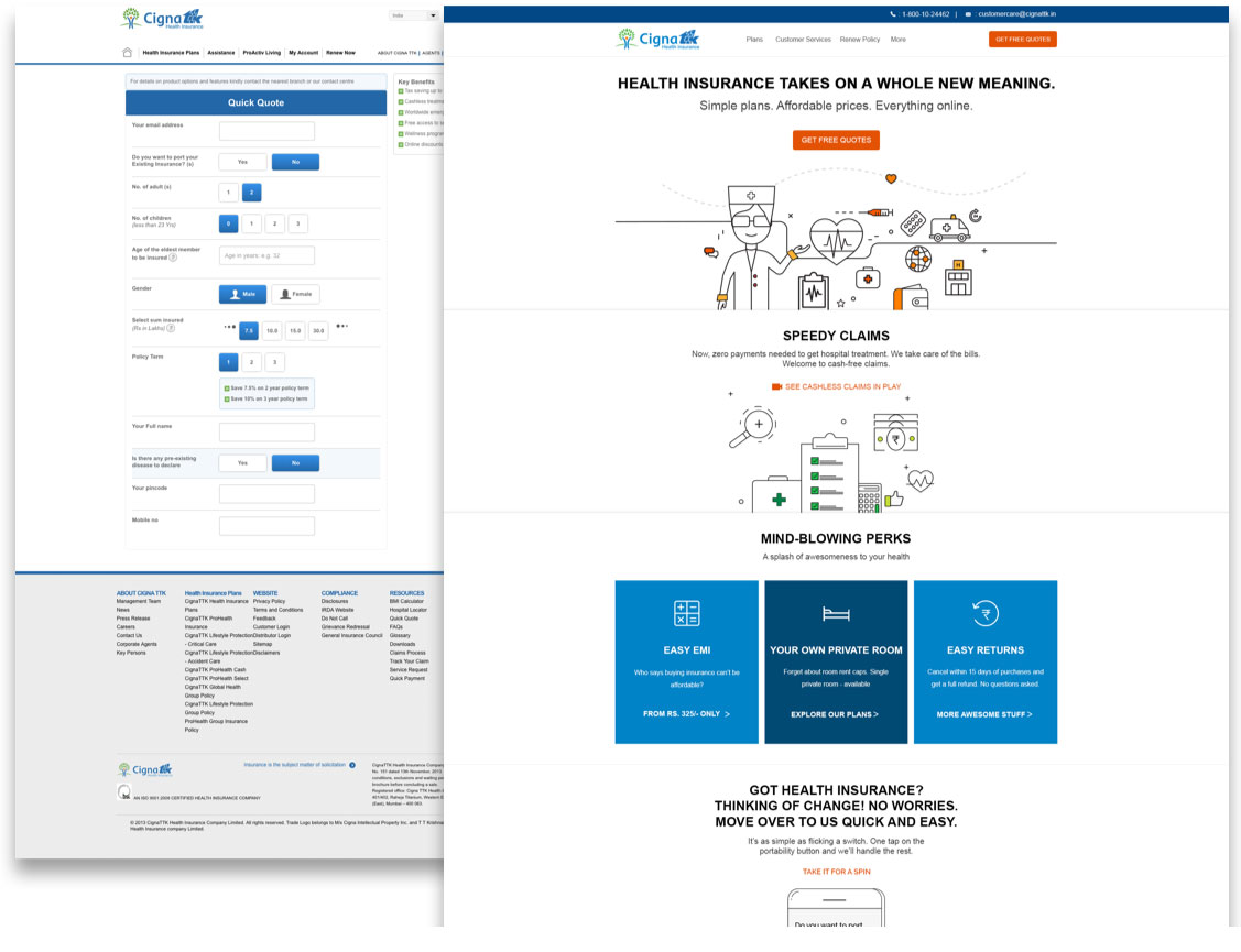
Because of a less than user friendly flow on the main website, online conversions were very low. For marketing to be effective, it was essential that the website is easy to use and navigate. The idea was not only to differentiate CignaTTK Health Insurance from other players visually, but also to convey that CignaTTK is much more flexible and offers benefits that no other brand offers. We had to design a user journey which handholds the customer when they require it.

With a small team of 3 developers and 2 designers, crunched timelines and with the idea that we need to change things radically and quickly, we adopted Agile approach. With the immense help from CignaTTK’s team, we were able to identify bottlenecks, prioritize things and deliver solutions quicker than even we ever thought. We knew that scale is going to be the biggest challenge as there were a lot of moving parts. Internal and external systems had to connected. We chose API based approach with frontend built on AngularJS Framework. Once we were happy with our architecture, it was time to move to the main ask of the project… User Experience Design.

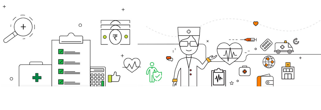
During the initial discovery phase in User Experience Design, we first tried to identify what works in the current user flow. Then we took the LIFT approach to identify improvements, benchmarked them against web standards, evaluated against competition and used our knowledge of web to make project recommendations. For the project it meant, wireframes, information architecture design, iconography, custom illustrations and finally, visual design.


With the success in designing and developing customer purchase path, we were roped in to do the same for CignaTTK’s partners and internal teams. The mantra to the success of these projects have been collaboration. We have since been part of CignaTTK’s journey and we have loved every bit of it.

 close
close